About the Client
Jefferies is a global investment bank headquartered in New York. The company provides clients with capital markets and financial advisory services.
The Project
Jefferies, like many large investment banks, provide research reports to their clients on various industries and companies. They produce ten different report types which are created by their analysts using a CMS called BlueMatrix. Currently, the reports generated by this CMS are only available in a PDF format.
BlueMatrix recently added HTML5 capabilities to their report generation options in addition to the flat PDF format. This enables the reports to be properly formatted and optimized for mobile devices via a responsive layout. It also allows for interactivity which assists users in navigating through these often lengthy reports. On the back end, creating these reports in HTML5 allows for tracking to see exactly what parts of the reports are consumed most often and allows the client to make changes based on this and other analytics.
Team Structure
• UX/Creative Lead (me)
• 2 UX designers
• Visual designer
• Front end developer
• Project Manager
The Approach
While the main goal was to convert the current PDF format into an interactive layout, the report itself also needed a major overhaul in terms of design. We started from the ground up, leaving no stone unturned. We conducted a heuristic evaluation on the current reports and pored through every single element.
I worked closely with SMEs to help better understand the finance-specific report terminology. From there, we sent around a survey to 16 analysts and asked them to rank a series of page elements in order of importance. This would help us determine where changes in the hierarchy could be made. Once the results were tallied, a clear picture was painted on how to proceed in the information hierarchy.
I created a script which was used to conduct user interviews. In total, I spoke with 8 analysts worldwide. After the first few interviews, I made some edits in the script to make sure we got the information we needed for our redesign. I recorded the interviews using join.me and this software enabled me to screen share as necessary.
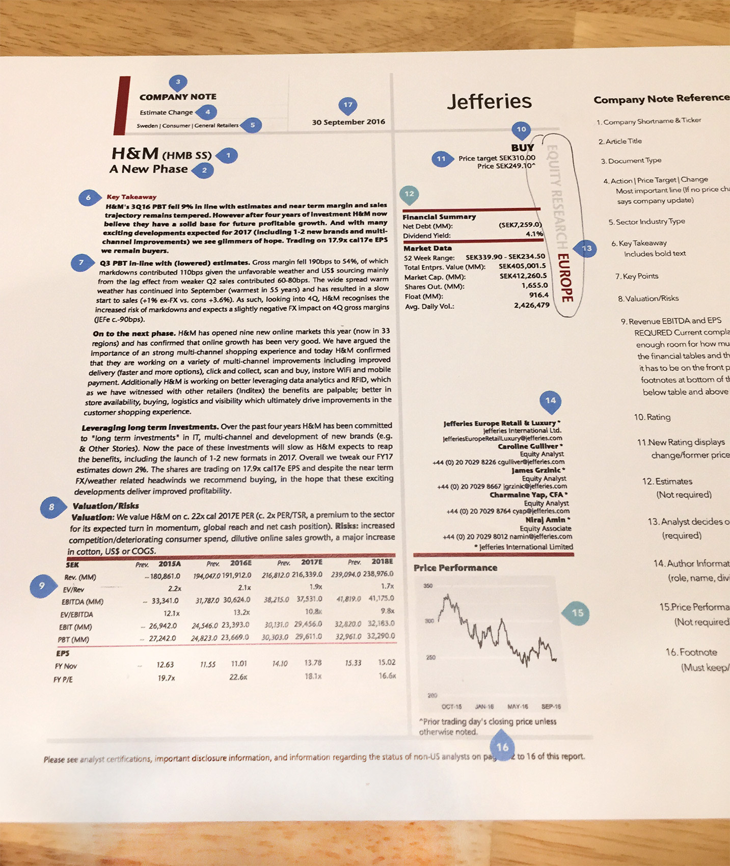
Reviewing the existing reports
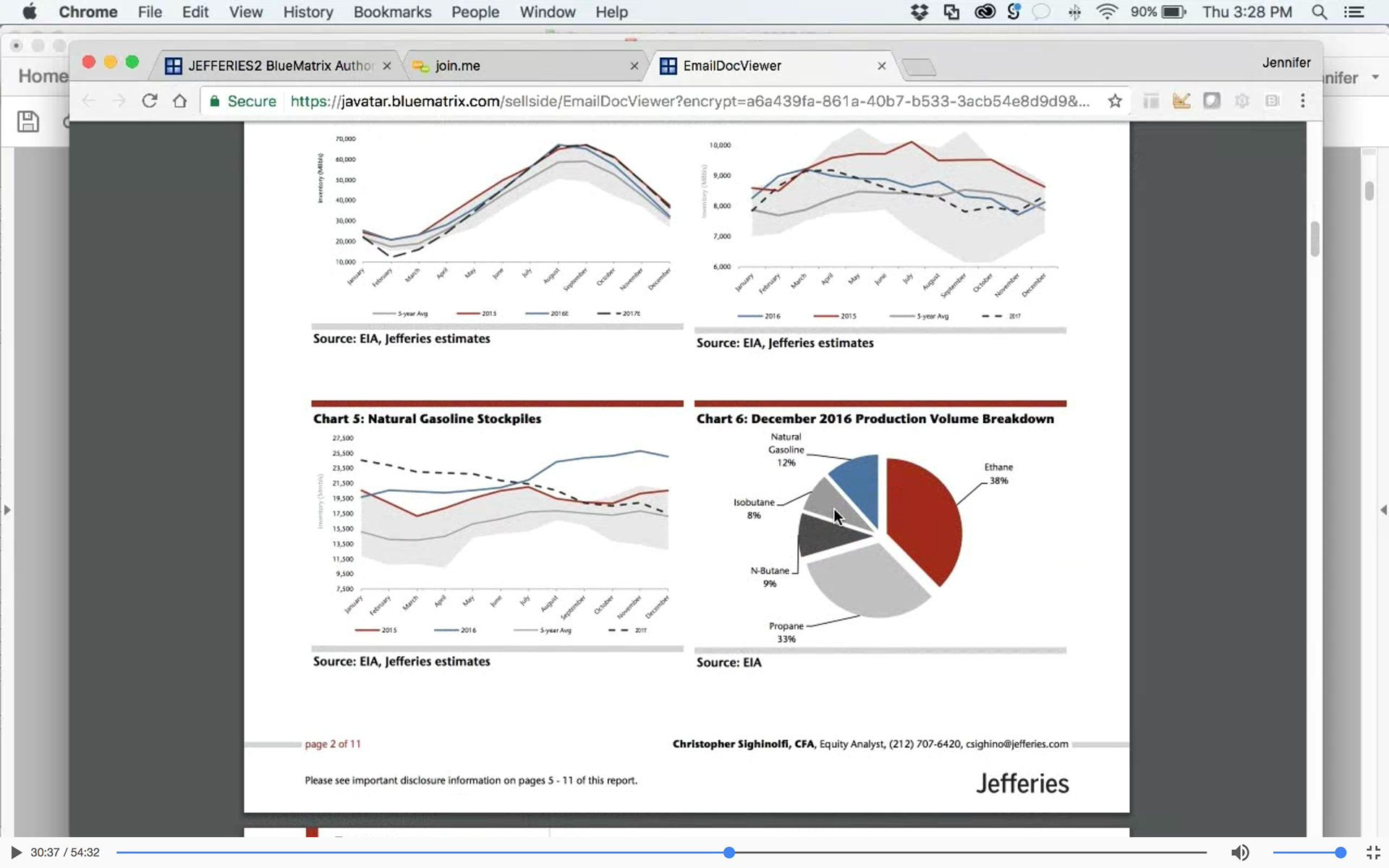
Interviews conducted via screen share
Competitive Analysis
I reviewed similar reports generated by other investment companies. This helped me understand where we could make improvements which would help Jefferies stand out from the competition. Among all the competitors reviewed, none had HTML5-enabled reports, making Jefferies among the first to use the latest technology.
The Redesign
Once I analyzed the research and set up our personas, I started to sketch out the new layout. I made sure we took a mobile-first approach in the redesign since mobile consumption of these reports is top priority. I took the current layout and re-prioritized every single element based on the survey we sent out and the feedback from our interviews. Then I categorized each section in the report and created a navigation structure.
The team created responsive wireframes for all 10 report types, supported by prototypes. Once these were approved by the client, three visual design directions were created. The client had multiple style guides for various marketing tools, but they were inconsistent and outdated. Save for a few font guidelines, we had free rein over the design direction. The client sought to apply the new design direction across all Equity Research products.
Before and after for the Equity Research report print redesign
Design Direction
The look for the new reports (and the research portal where the reports are accessed) was influenced by a number of factors. I reviewed the competitors reports with the client and I pointed out elements that worked well and where we could do better. I showed them other site examples (some finance, some not) to see what looks they gravitated towards. Once I had an idea of what they liked, I showed them to the team and we generated three design directions. The directions were influenced by flat design, HTML 5 and modern color palettes. The client selected a safer color palette, consisting of cool blues, which tend to have a broader appeal.
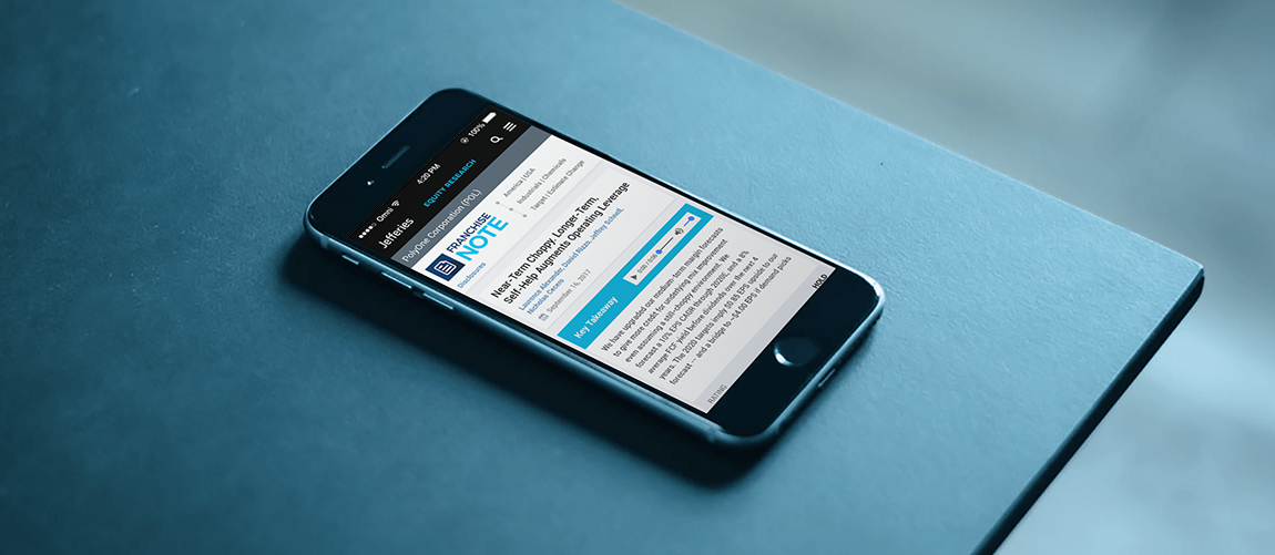
Mobile report view
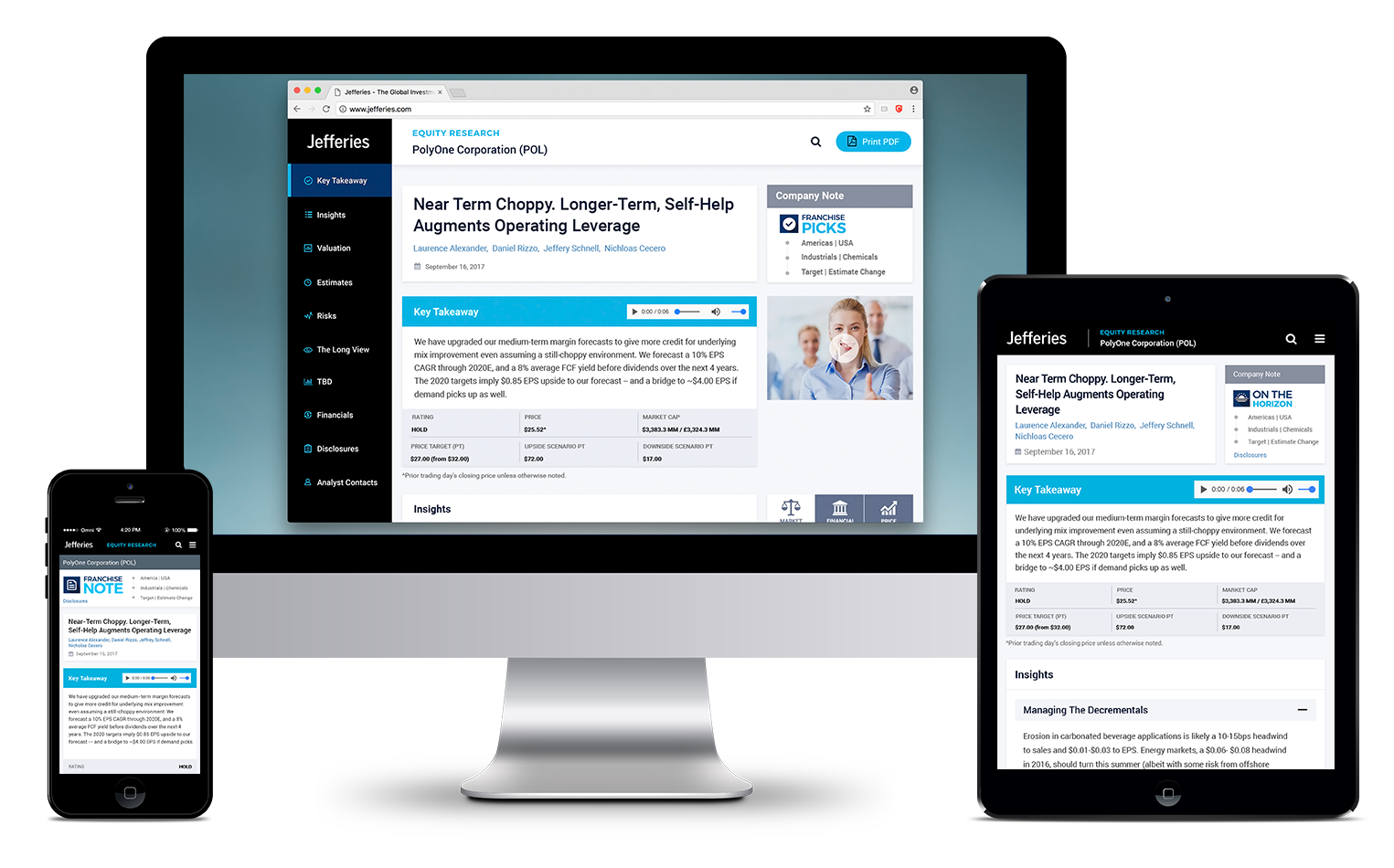
Cross-platform report views
Result
Once the design direction was chosen and all design details were fleshed out, I created a pattern library and detailed specs to hand off to BlueMatrix, the CMS provider. A working prototype, created by the developer, was also provided to BlueMatrix to integrate into their system. The client were happy with the design and expressed their appreciation. Take a look at the mobile prototype.


